Finding My composition
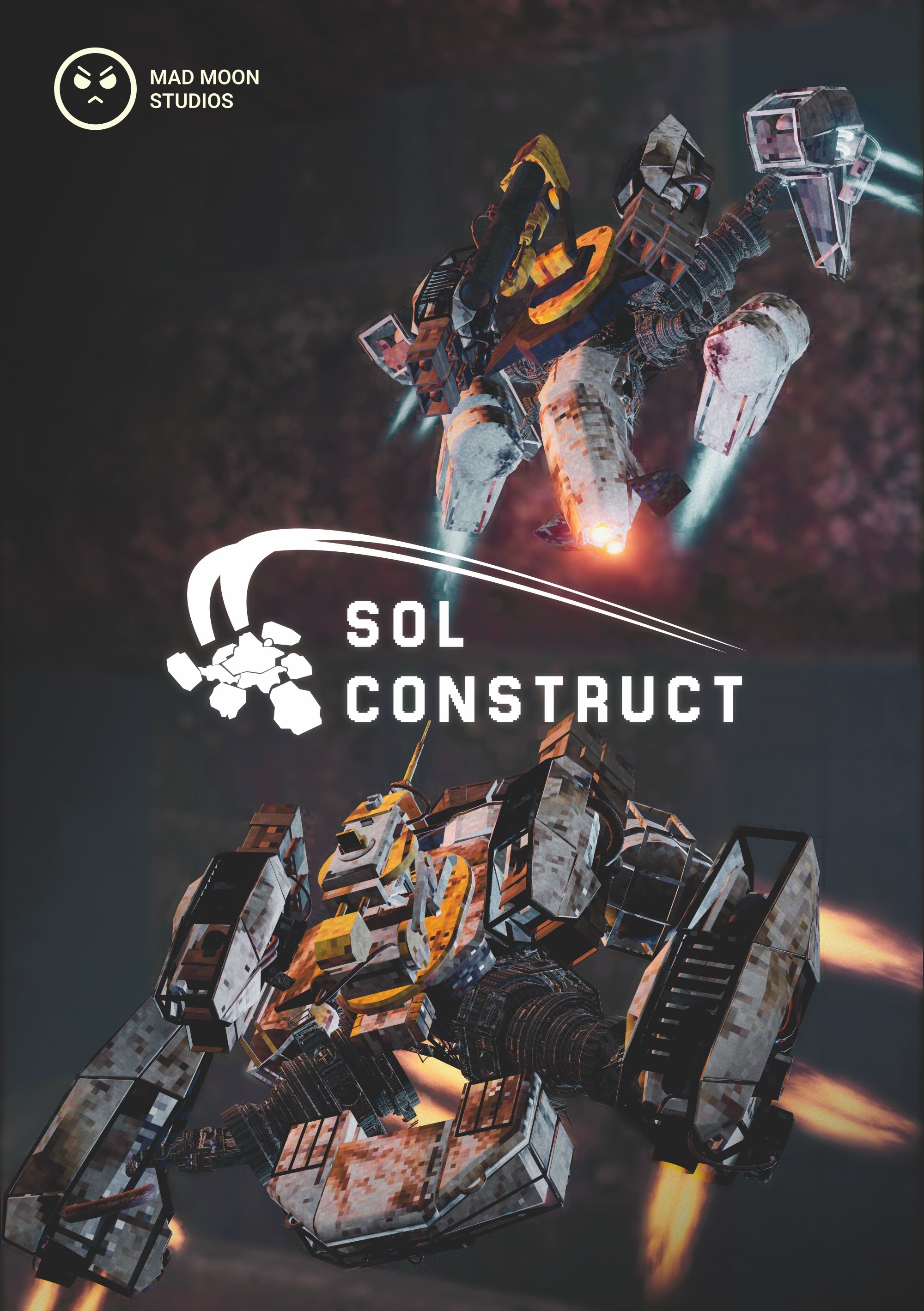
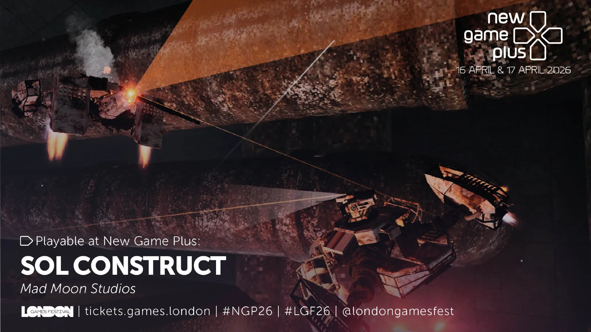
Alright, I have to come clean, this isn’t exactly a first attempt, but more of a recreation of a Poster I created a couple months ago for London Games Festival where we got demo our game at New Game Plus. There are still some inspirations and reasons I want to go over on why this composition, but before that, take a look at what we sent off.
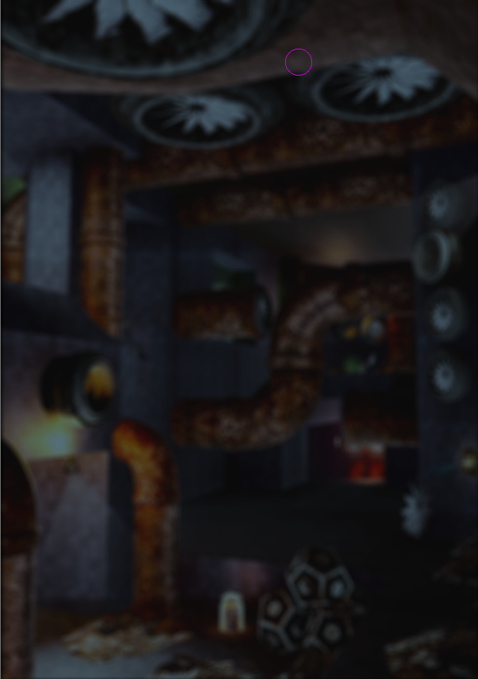
From the outset, it’s really important that we communicate our unique selling points in our images. For this poster and it’s subsequent recreation, I was particularly focused on “Flight”, and not just showing that things can fly, but show how dynamic and expressive they are doing it. A cheap way to achieve that is to grab an action shot at just the right moment. Back then that method was all we could muster with the limited time there was to put together a Press Kit and send it off to LGF. But this time I wanted to put more time into thinking about form and space, which is even more exciting knowing that the whole page can be used instead of just the top half (Our booth table cut the bottom part off).
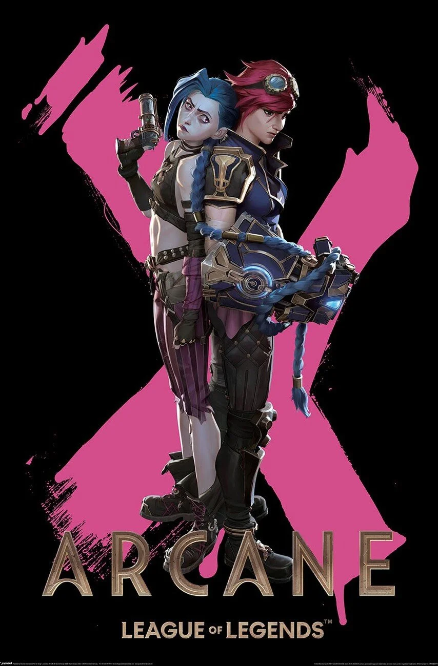
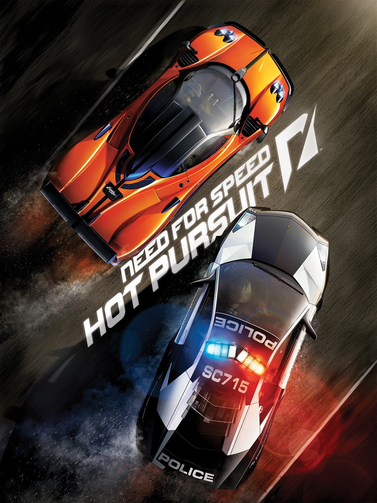
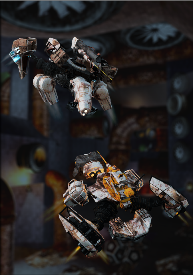
There’s definitely a subconscious tendency or maybe even an affordance to position “duo” characters in mirrored poses. This definitely crept into my own design too, because symmetry just seems to work;
Our brains like it: We’re biologically wired to look for symmetry. When we see a perfectly balanced image, it just feels "right" and brings balance to the composition.
Minimal guesswork: Instead of your eyes wandering around the frame looking for the action, mirrored shots force all the visual weight right to the middle. You know exactly what you're supposed to be looking at, which is especially useful when the subject matter is a pair of flying machines people have never seen before.
I initially tried rendering out the alpha channel too, but that led to a tonne of our VFX just fading out and really messed with our bloom and other post processing, but I was determined to salvage it.
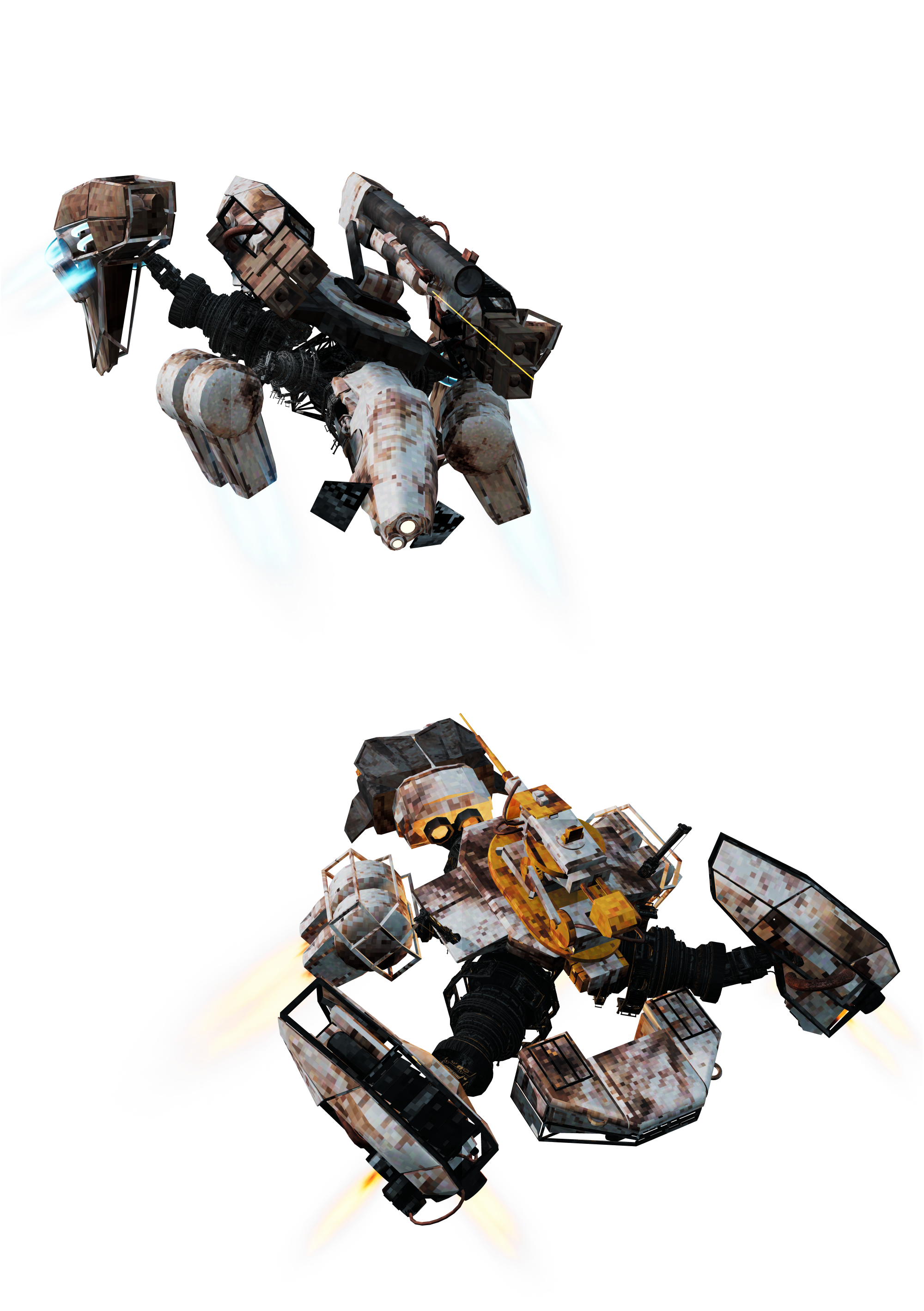
Composite Render
A Composite Render using 3 different renders to try get around the alpha fade out.
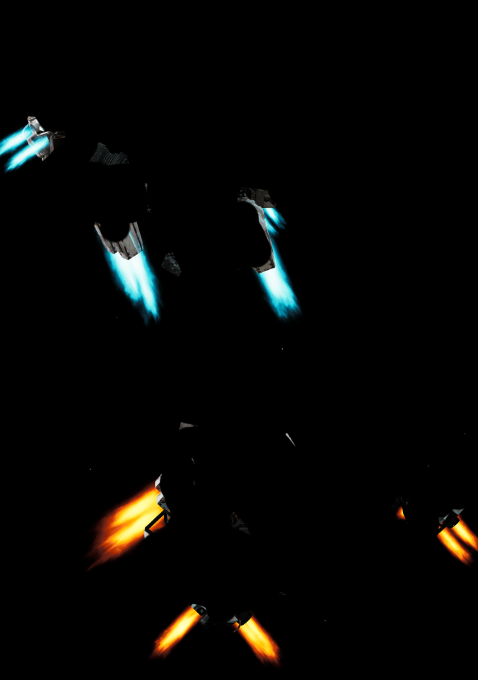
The Initial Background layer was brought into Krita where I played with some colour ramp filters to desaturate it a touch and apply a Lens Blur across the whole layer. On top of that I added the Vehicle Render including the alpha channel. Obviously the VFX is completely broken across the whole shot, so next I rendered the same shot of the Player and Enemy with Alpha disabled. Now I had full saturation with my colours and a black background that I brought into Krita. I applied a “Colour to Alpha” filter to remove as much black from the image as possible. Now that the background was gone I manually erased the metallic parts of the vehicles leaving just the fully saturated layer of VFX which I then applied as the final Layer in this composition.
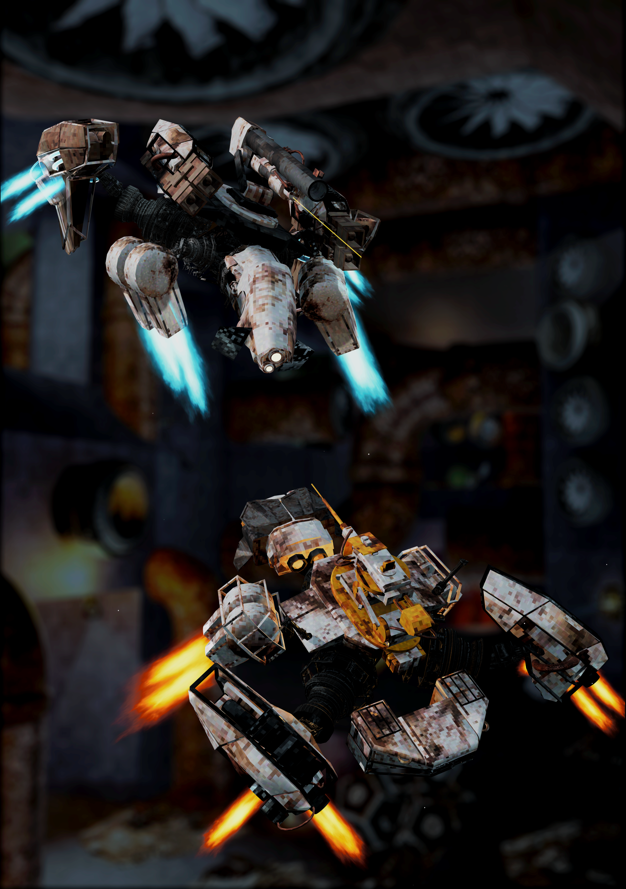
This was fun and I managed a pretty cool workaround to get as close to what the game’s colours look like, but the layering made the composition look really flat, considering I also used very simple lighting with no rim lighting or differences in hue. So rather than rendering separate layers and putting them together in Krita, I decided to get everything I needed one shot.
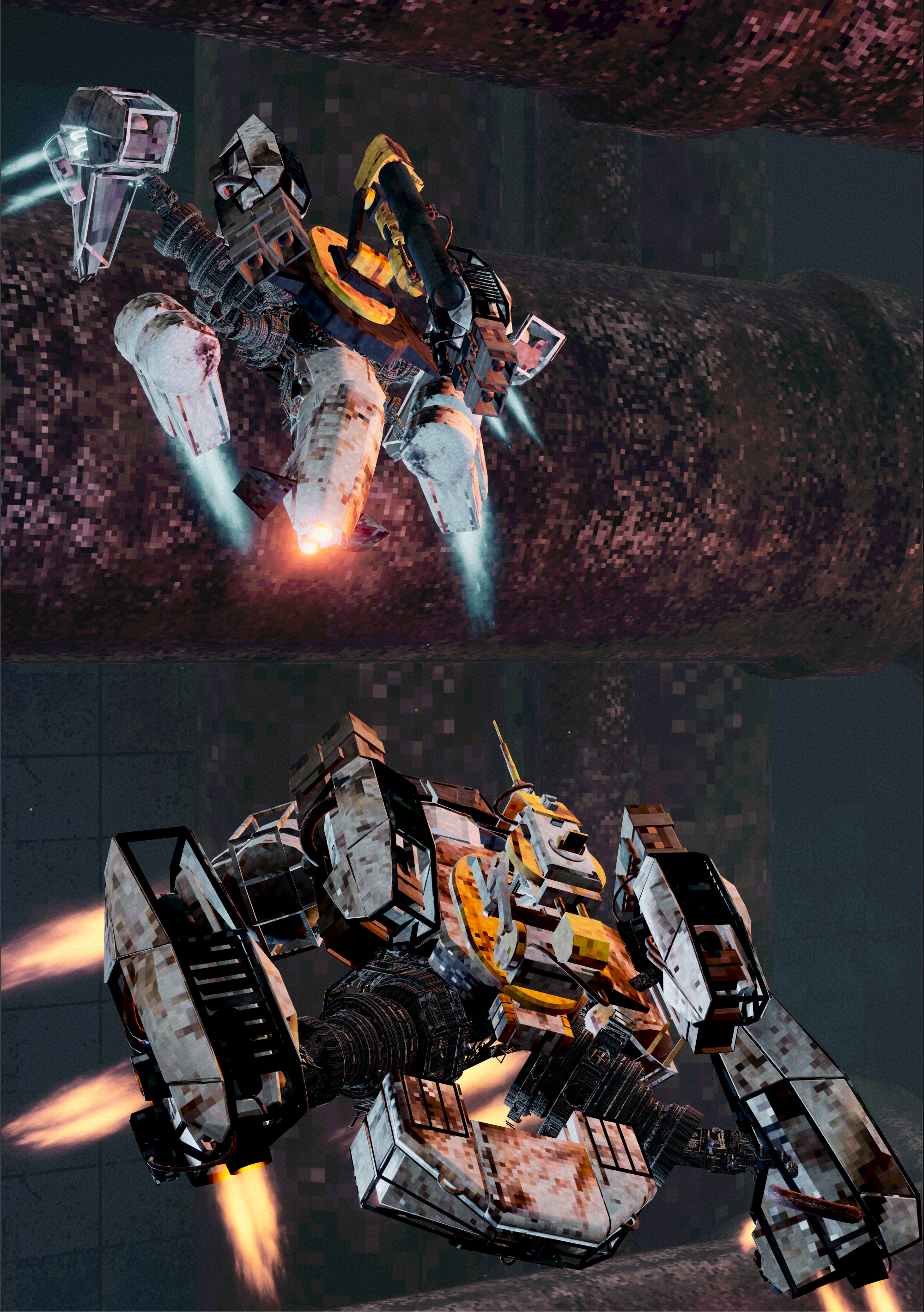
After playing around with the Player and Enemy’s rotations and positions, I landed on a much more “full” composition. Paired with some more dramatic lighting to create a more varied palette and the inclusion of the physical space I was able to let some of my in-game post-processing do some more heavy lifting.
Logo Time!
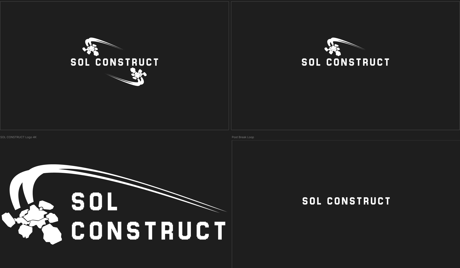
With a nice shot in the bank, what was I going to layer on top of it? When we submitted our initial poster for London Games Festival, we realised just how much of a shift our game has actually gone through over the past few months and new committing to a full rebrand would probably work in our favor and boost our morale at the very least, which included updating our logo.
We were actually quite pleased with how our original logo for SOL DRIFT turned out and we got a tonne of mileage out of it. SOL CONSTRUCT still reflected that same energy and focus on flight so we didn’t want to deviate too much. However, this time we wanted to put a little more emphasis on clarity. In the past SOL DRIFT often merged into different words a glance. This time we put more effort into letter spacing and more importantly word spacing, ultimately choosing to abandon the circular logo and lean into an asymmetrical design which you can see in option 3 below.
With the words spaced out vertically and framed together with a single stencil of our character, and some extra spacing between elements to reduce visual clutter since it’s all one colour, we felt it was much easier to read.
Back to krita
With render and logo in tow it was time to get back into Krita and fix it all up! This is where I underestimated just how taxing EXR files were. I can’t speak for Zach’s file, but mine used up over 13gb of RAM at one point which made some later actions very slow. It was absolutely worth it though, having full access to a HDR render and all of its data. After some initial colour correction following the colour space conversion to CMYK, I was able to start framing things and start adding some juice.
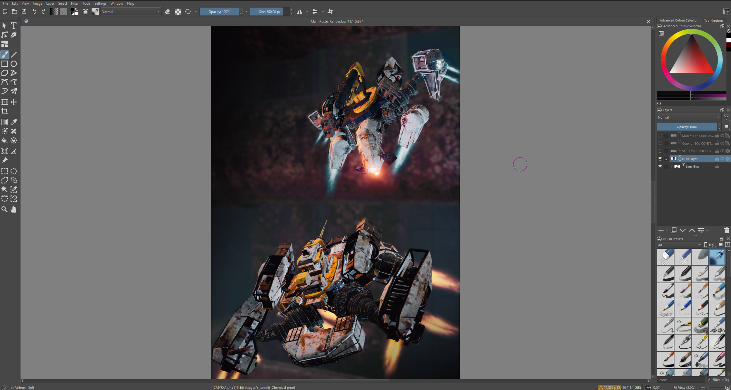
First came the Lens Blur. Using a mask filter with Black and White colours for opacity, I slowly (and painfully) painted in the player and enemy characters until they were focused. This paired with the actual background rendered in ended in a surprisingly good compromise for not initially rendering with a focus distance. It let me stay flexible and experiment with other filters using the same mask!
I then started adding gradient maps to the corners to create a custom vignette, just to highlight that center composition even more, and create an even dark background for where some of the Logos were going to sit.
When it came to adding the Logos, I actually found the composition to work better when flipped, letting the asymmetrical logo flow with the composition of the two vehicles, and to top it all off I slapped our studio logo in the dark corner and voila!
All that was left was the export. Sadly Krita doesn’t allow PDF export so I used an open source text editor Scribus, which let me import my CMYK JPEG and export it to that crisp 300 dpi PDF ready for printing!